Non-cascading CSS: The follow-up
This is related to the post Non-cascading CSS: A revolution. In that I talked about 9 proposed rules to write genuinely reusable and maintainable CSS (inspired by www.lispcast.com/cascading-separation-abstraction):
- A standard (html5-element-supporting) reset sheet is compulsory, only bare selectors may be specified in it
- A single "common" or "theme" sheet will be included with a minimum of default styles, only bare selectors may be specified in it
- No bare selectors may occur in the non-reset-or-theme rules (a bare selector may occur within a nested selector so long as child selectors are strictly used)
- Stylesheets are broken out into separate files, each with a well-defined purpose
- All files other than the reset and theme sheets should be wrapped in a body "scope"
- No selector may be repeated in the rules
- All measurements are described in pixels
- Margins, where specified, must always be fully-defined
- Border and Padding may not be combined with Width
Shortly after that I re-wrote the styling for this blog to ensure that the principles held sound (since I've started keeping my blog in BitBucket, you can find it here). And I'm happy to say that they did! In fact, after a very short adjustment period, it felt very natural and somewhat reassuring with its structure. It felt like writing good code rather than the CSS I've written before that left functional but somewhat lacking.. something. (And trust me, I've written a lot over the years).
Each file felt comfortably self-contained and logical. I was particularly happy with how simple the layout.less file was, despite handling the media queries to render the content differently on smaller screens.
Amendments
Having talked to more people and considered the uses in the context of particular scenarios I still feel confident that they nearly all hold firm. With one exception..
All measurements are described in pixels
This rule has so much promise and is able to deliver so much if it can be applied everywhere. As outlined in the original post, it solves the compound issue with percentages or ems being applied to multiple layers (so a paragraph's font-size of 80% will be affected by its parent div element's font-size of 90%, for example).
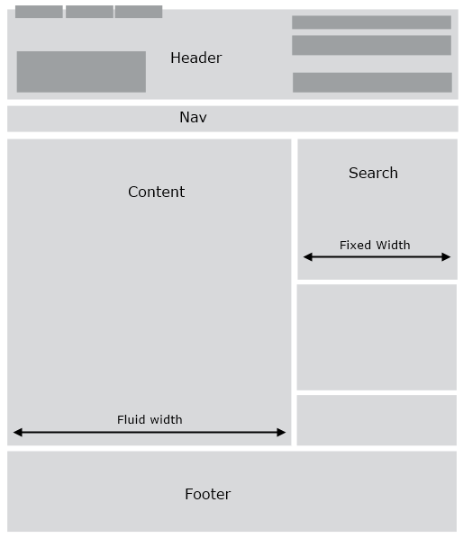
It has the potential to make some responsive designs I've seen easier to implement. Some current accepted wisdom is that all dimensions should be specified in percentages so that the design is "fluid". Using the example of a page split into two columns such that there's a main content area and a side bar, in many cases it's entirely possible to have the sidebar be fixed width and then leave the main content area to fill the remaining width.

This has the benefit that the narrower side bar controls can be styled more predictably - they don't have to deal with as much jiggling about as the available horizontal resolution varies. And often in scenarios like this, the space and element arrangement of side bars can be quite tight. If there is a search image button, for example, you must make sure that it can't become too wide to fit into the available width as the width is reduced with a fluid-width side bar. The content area, on the other hand, is more likely to lend itself to flexibility due to its wider nature.
For common breakpoints less-than-480px, up-to-600px, up-to-768px, up-to-900px and greater-than-900px, there may be a fluid layout between 600px and 900px. Below 600px the design may have most elements full width (similar to this blog in reduced-width formatting) and above 900px it's common to be fixed width to prevent content areas from becoming too wide and lines of text becoming too long. If the side bar is 250px wide, say, the content area will vary between 350px and and 650px but the formatting of the side bar need not vary. There may be an argument to have a mid-way point for the side bar to be 300px wide when the horizontal resolution is greater than 768px whilst 200px wide between 600px and 768px. Now there are two variations for the side bar formatting but the content width only varies between 400px and 600px.
I think there's a lot of mileage to be had from this joint fixed-width / fluid-layout combination.
BTW, if you haven't read the classic "A List Apart" article Creating Liquid Layouts with Negative Margins (from 2004!) then be sure to check it out - when I came to actually trying to implement fixed width side bar(s) with a fluid width main column I came a bit unstuck until I rooted this out and refreshed my memory on what is basically the definitive way to do it.
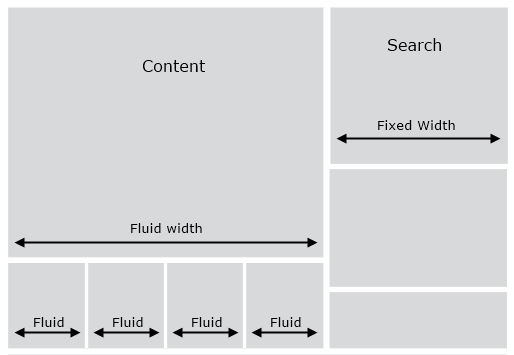
However, there is one point at which I've become stuck. I've seen designs which have a horizontal gallery of items: imagine a row of images with captions beneath them. In a similar design to that shown above, these would appear below the content area - so within the 400-600px wide region. The design requires that four items be displayed within the gallery at all times. The current approach I've seen to implementing this is for a wrapper around the gallery to effectively be 100% of the available width and then for each of the four items to have a width of 25%. This means that they resize as the available width changes. The image for each item has a width of 100% which ensures that it fills the space it has within the 25% section.

I don't really like this because in order for the image to fit within its gallery item container, it has to specify this 100% width. But I can't see any way other than this approach to make it work. I'd like a way to specify a fixed width for the gallery items and for them to arrange themselves with horizontal whitespace to stretch across the whole width, possibly with a change to the fixed width at the 768px breakpoint as suggested for side bar above. This would make styling the items much simpler and predictable. But unfortunately I haven't quite managed to come up with a way to do this in CSS yet! So I might have to admit to relaxing this rule in some cases. That's not to say that I've completely given up on a way to work round this, at which point maybe the rule can be promoted again!
One other note about "pixels everywhere"; I'm definitely onboard with the idea with the principle of specifying media queries in ems, as mentioned in my first post about this (and as taken straight from here: The EMs have it: Proportional Media Queries FTW!). I've done that with the breakpoint in my blog formatting so that it's not a pixel width that I break at but 35em. This means that if the browser font size is increased sufficiently that the breakpoint will be passed and the formatting changed. I've noticed that Firefox will do this immediately when the font size becomes large enough but with Chrome the page has to be refreshed after increasing the font the blog, then the reduced-width layout would be used).
Return of the CSS Minifier
I'm going to write another post now about some changes to the CSS Minifier project that I've written about before (On-the-fly CSS Minification). Some time ago I included a reference to dotLess to enable the compilation of LESS but I've now added further functionality such as a form of source mapping (indicating where styles in compiled output originated from), a way to address the overhead of Rule 5: All files other than the reset and theme sheets should be wrapped in a body "scope" and a way to automatically group media queries. See Extending the CSS Minifier.
Posted at 13:48
Last time:
WinDbg Rides AgainAbout
Dan is a big geek who likes making stuff with computers! He can be quite outspoken so clearly needs a blog :)
In the last few minutes he seems to have taken to referring to himself in the third person. He's quite enjoying it.
Recent Posts
- Hosting a DigitalOcean App Platform app on a custom subdomain (with CORS)
- (Approximately) correcting perspective with C# (fixing a blurry presentation video - part two)
- Finding the brightest area in an image with C# (fixing a blurry presentation video - part one)
- So.. what is machine learning? (#NoCodeIntro)
- Parallelising (LINQ) work in C#
Highlights
- Face or no face (finding faces in photos using C# and Accord.NET)
- When a disk cache performs better than an in-memory cache (befriending the .NET GC)
- Performance tuning a Bridge.NET / React app
- Creating a C# ("Roslyn") Analyser - For beginners by a beginner
- Translating VBScript into C#
- Entity Framework projections to Immutable Types (IEnumerable vs IQueryable)
Archives
- April 2025 (1)
- March 2022 (2)
- February 2022 (1)
- August 2021 (1)
- April 2021 (2)
- March 2021 (1)
- August 2020 (3)
- July 2019 (2)
- September 2018 (1)
- April 2018 (1)
- March 2018 (1)
- July 2017 (1)
- June 2017 (1)
- February 2017 (1)
- November 2016 (1)
- September 2016 (2)
- August 2016 (1)
- July 2016 (1)
- June 2016 (1)
- May 2016 (3)
- March 2016 (3)
- February 2016 (2)
- December 2015 (1)
- November 2015 (2)
- August 2015 (3)
- July 2015 (1)
- June 2015 (1)
- May 2015 (2)
- April 2015 (1)
- March 2015 (1)
- January 2015 (2)
- December 2014 (1)
- November 2014 (1)
- October 2014 (2)
- September 2014 (2)
- August 2014 (1)
- July 2014 (1)
- June 2014 (1)
- May 2014 (2)
- February 2014 (1)
- January 2014 (1)
- December 2013 (1)
- November 2013 (1)
- October 2013 (1)
- August 2013 (3)
- July 2013 (3)
- June 2013 (1)
- May 2013 (2)
- April 2013 (1)
- March 2013 (8)
- February 2013 (2)
- January 2013 (2)
- December 2012 (3)
- November 2012 (4)
- September 2012 (1)
- August 2012 (1)
- July 2012 (3)
- June 2012 (3)
- May 2012 (2)
- February 2012 (3)
- January 2012 (4)
- December 2011 (7)
- August 2011 (2)
- July 2011 (1)
- May 2011 (1)
- April 2011 (2)
- March 2011 (3)